

Evernote Design System / 2017
Building Evernote’s design system and a more cohesive user experience
Background
Since Evernote’s early days as a Windows application, the company’s philosophy was to build the best native experience possible. This also stemmed from a time when Mac apps—and later iPhone apps—were beginning to gain popularity. The vast majority of apps adopted UI components and patterns unique to the particular platform.
As the product team at Evernote grew, cross-functional teams were assembled around each platform we supported: Windows, Mac, iOS, Android, and Web. Each team had their own objectives and specific roadmap. Naturally, operating in this way led to differences across these platforms; some minor while others were vast. Of course there would be differences between the mobile and desktop apps, since they tended to serve different purposes for users, but as these differences grew, they became a pain point for those who often worked between multiple devices.
The core problem
Over the past few years, Evernote’s product strategy had shifted to focus and invest heavily on teams and collaboration. To support this vision, Evernote’s overall UX needed to evolve. The main issues that stood out included:
UX inconsistencies between platforms led to a steeper learning curve.
A disjointed visual language was causing confusion and made us look unrefined.
It became more difficult to collaborate with others, particularly colleagues, since users weren’t always looking at the same thing.
Paying customers, including Premium and Business, had high expectations. A different UX is not the norm. People are used to familiarities between mobile and desktop.
The image below demonstrates the vast divergence of visual styles across some platforms. (Windows and Mac never even had any green!)

Evernote’s family of apps before 2018
My role as design manager of platforms
At the time, I was heading up design efforts for our Platforms team, which meant I was the voice for our users and constantly championed for them. I represented product design as a key stakeholder for our product strategy and roadmap, our quarterly planning process, and our global design system initiative.
As 2016 was coming to a close, I had recently led a major redesign of Evernote’s iOS app, which included an overhaul of both the UX and the visual language. The team had agreed that this new visual direction was what we wanted to apply going forward. I then worked with our VP of Design to propose a strategy for making such improvements across our family of apps.
Getting buy-in
Working closely with my product and engineering counterparts, I advocated for finding opportunities to prioritize implementation of the new design system across the board.
Ultimately we agreed upon a dual-track approach. We would balance between giving our users features they want and need (visible improvements) and achieving our business objectives—to become a profitable, sustainable company via an increased focus on teams and collaboration.


Strategic alignment and risks
We also wanted to ensure that these efforts would be truly worthwhile for the company. We determined a few KPIs to measure, including second client on-boarding (note creates, retention, etc), CSAT, and time to design and execute. Risks included potentially affecting our CSAT for existing users who are often resistant to change.
Benefits for the user
Gain a more unified and familiar experience across devices
Increased productivity and efficiency in getting things done
A higher quality and more performant application
Benefits for the business
Happier users who recognize the value of Evernote (and pay!)
Streamline the workflow for designers and developers (no more designing 5x)
Provide the design team with guidelines and standards to scale the system
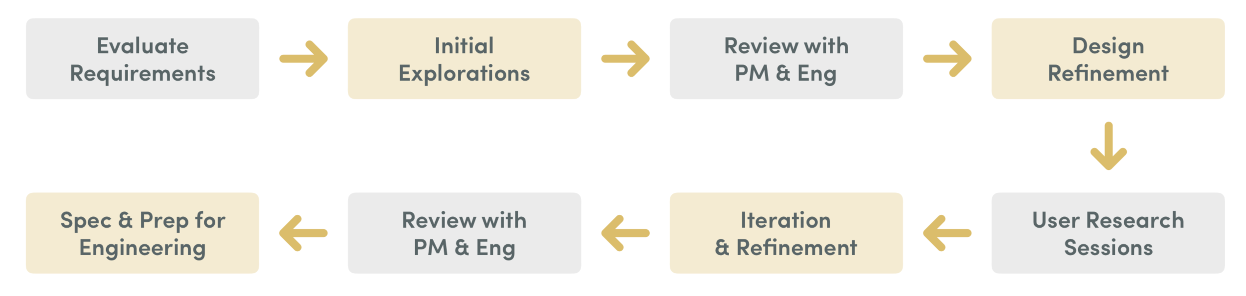
How will we achieve this?
As the design team worked hard to expand the design system I had created for iOS, we evaluated how we could best bring these changes to life. Lucky for us, our executive team gave us their full support, and shared our excitement to introduce a new design language.
Our approach became to do in a more incremental way. Our most active users were loyal, invested, and rely heavily on us for being productive. We realized we couldn’t just flip their world upside-down by making drastic changes.
A disciplined focus to hone in on key screens users see most often (navigation, note list, note editor, search, etc)
Chunk work into smaller, manageable projects versus full out re-designs
Iteratively build a framework to support A/B testing for quick learning
Drive more consistency between Mac/Win and iOS/Android
Our approach:
“The overall goal is to create a more cohesive experience and integrate a unified design system across all of Evernote’s platforms.”
Rolling out the new system
Changes began rolling out in the latter half of 2017, starting with the new Web experience (then in Beta) and the Mac app. These changes first focused on the navigation pane, including a consistent location for the New Note button, as well as the note list and editor.
Though I’ve since left the company, I know the team is in good hands and set up to successfully continue executing this effort. 🙌

A cohesive navigation across all desktop clients: Web, Mac, and Windows
