
Cinch Financial / 2018
Cinch’s mission is to create an experience that provides the benefits of a personal financial advisor—personalized, holistic, and unbiased financial advice—to everyone.
My role at Cinch
As a product design lead, my role involved taking complex financial concepts and transforming them into human-centric, user-friendly, and easy to understand experiences and tools for everyone.
Our small design team of five closely collaborated with a cross-functional team. I worked hand-in-hand with engineers, data scientists, user research, and product managers. The overall product team was split into tracks (based on projects), which included 4-7 engineers, 1-2 data scientists, and a PM. Our design team worked closely to support multiple tracks.

Launching the Spending MVP
I joined Cinch’s UX team at the beginning of 2018. At the time, Cinch’s offering included just their personalized advice across different verticals—credit card debt, student debt, car and life insurance, and savings. The team was working on a new spending/budgeting experience, and I was able to help the team finish building out this significant feature. Our MVP was shipped in late February 2018.

Components of Snapshot, part of Cinch’s initial offering before Spending
Discovering the pain points of traditional budgeting
Before I arrived at Cinch, the team had a hypothesis that the traditional ways of line-item budgeting just weren’t working for people. The team’s research revealed that people found line-item budgeting, with apps like Mint, to be tedious and unforgiving. The average person doesn’t often have warm, fuzzy feelings when they think about money. Instead they feel uneasy, insecure, and often discouraged.
With so many people trying to survive the vicious paycheck-to-paycheck cycle, we wanted to create a better solution—one that was more flexible, realistic, and easy.
Introducing Pocket Money
Pocket Money was created as a target for the user’s discretionary spend over the course of a given month. As spending occurs, Cinch displays the single “left-to-spend” amount to help the user keep track.
In order to get a personalized Pocket Money number, users are prompted to link the bank accounts where they receive income, pay bills, and do their spending. Ideally users would link checking and savings accounts, as well as credit cards.
How it’s calculated
Pocket Money is calculated based on an individual’s previous month’s net income. Cinch’s recurrence algorithm detects patterns and automatically identifies recurring monthly bills and expenses. Users are able to verify their monthly bills, add any that may be missing, and the expected bills amount will be set aside from Pocket Money. Next, we reserve a portion of the user’s income for a realistic savings target. The user is left with a single number to follow.
And that’s it. No need to create separate budgets by category. Pocket Money gives users the flexibility and freedom of spending on what they want—no judgements from us.


Gaining trust of a single number
Knowing it can be difficult to change a mindset, particularly something like line-item budgeting that is so familiar, we had to find ways to assure the user that they could trust and rely on their monthly Pocket Money number.
This consideration manifested in several ways:
We provided an on-boarding experience that walked users through how Pocket Money is calculated.
We allowed users to re-categorize transactions in order to properly identify their monthly income and bills.
Users could any ignore transactions from their spending if it was a large, irregular expense, that wouldn’t normally be considered in their budget.
We sent timely notifications and warning signals through SMS and email when at risk of over-spending.

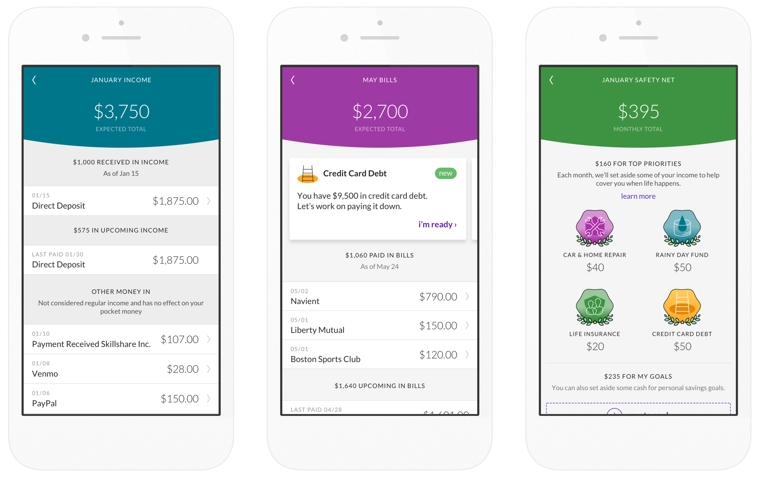
The sections within Spending include Income, Bills, and Safety Net
Improvements to spending
After the initial launch of the new Spending experience, there was still a lot of work to be done. Together as a cross-functional team, we prioritized a set of features to continue building over the next few months. This included things that didn’t make the MVP, as well as other features and improvements to continue refining the experience.
Continued user research
While the team had our own list of improvements that were top of mind, we also wanted to continue user research to assess how the experience was being perceived and used thus far. With the help of our UX researcher, we first organized a focus group to gain additional insights into the behavioral side of spending and finances. Later, we conducted 8 remote usability sessions, where we focused on the user journey from sign up into the app, then around some conceptual mockups of work in progress.
Focus group findings
For the focus group, our UX researcher recruited 10 women between the ages of 25-40 to participate. They had never heard of Cinch, but all had some experience with budgeting and finances for themselves and/or their family. Our researcher led a variety of individual exercises and facilitated group discussions throughout the session.
Study objectives
What were their thoughts and behaviors around money? What makes people feel good or bad? What triggers these feelings?
How do people think about and organize their money, either mentally or physically?
What do people want help with in regard to their finances? What’s most important to them?
What do they need to know to feel financially secure?

Stats and criteria of focus group participants
Key insights
People need an easier way to understand how much they spent on bills and discretionary expenses.
Most participants assigned roles to their money and bank accounts. They often used multiple accounts to differentiate between funds (emergency fund, for bills and rent, secret accounts, “don’t touch this”, etc)
Participants want their money to go further. They know they aren’t “making the most of it", but aren’t sure what to do. They want guidance and recommendations.
They want help overall achieving financial goals, but also desire personalized advice for specific situations. For example, what should I do with my bonus? Put it into my retirement? Pay off a credit card? Pay down student loans? What’s best for my situation?
And finally, people desire an app that supports them in a straightforward, honest way. They don’t want a cheerleader, or to feel overly guilty.
Overall, these further rounds of research helped confirm our hypotheses and we felt confident that we’re continuing upon the right path.
End of month financial check-up
Our spending experience is structured around a month timeframe, so it was important to provide users with a summary of how their spending compared to their Pocket Money target, as well as set them up for the next month. Reflecting on previous months spending could mitigate impulse spending behaviors in the current month by “reflecting and resetting”.

The first iteration of End of Month review
First iteration
The first version of the end of month review covered the basics, but lacked details of how a user performed overall, not just their spending.
Cinch is able to view and analyze transactions, track account balances, and even the different types/amounts of debt a user may have. We should be able to offer more insights and advice about the financial decisions a user has made.
Objectives
How can we give users a more comprehensive assessment of each month?
How can we show changes in cash and credit card account balances?
How can we make users aware of their trends, such as showing a several month streak of spending below their target?
What salient and personalized advice can we offer users based on their performance?
Defining the new experience
I took the lead on redesigning the end of month review experience. Working closely with our data science team, we brainstormed to determine what data and information would be helpful to show. Taking the insights learned from our research into consideration, I envisioned providing the user with comparisons from previous months, and details of where exactly their money went. I also wanted to sprinkle in some narratives to provide encouragement when things went well, or to offer some actionable advice if they didn’t do so well.

Whiteboard sketches during the design and definition phase
Iterate, and iterate some more
During the design and definition stage of this project, I held several design sessions to review the work in progress and get feedback from various stakeholders and team members.
This project went through several rounds of iteration, mainly because there was so much information available to us that we could show! There were graphs and charts and numbers galore. What we needed was feedback from actual users to really hone in on what was most important from their perspective.
At this point, we had a few other design projects in the definition stage, so we took the opportunity to conduct some usability sessions with several remote participants. For this research, our goal was to gather feedback and determine comprehension, benefits and expectations.

Part of an early mockup
Key findings
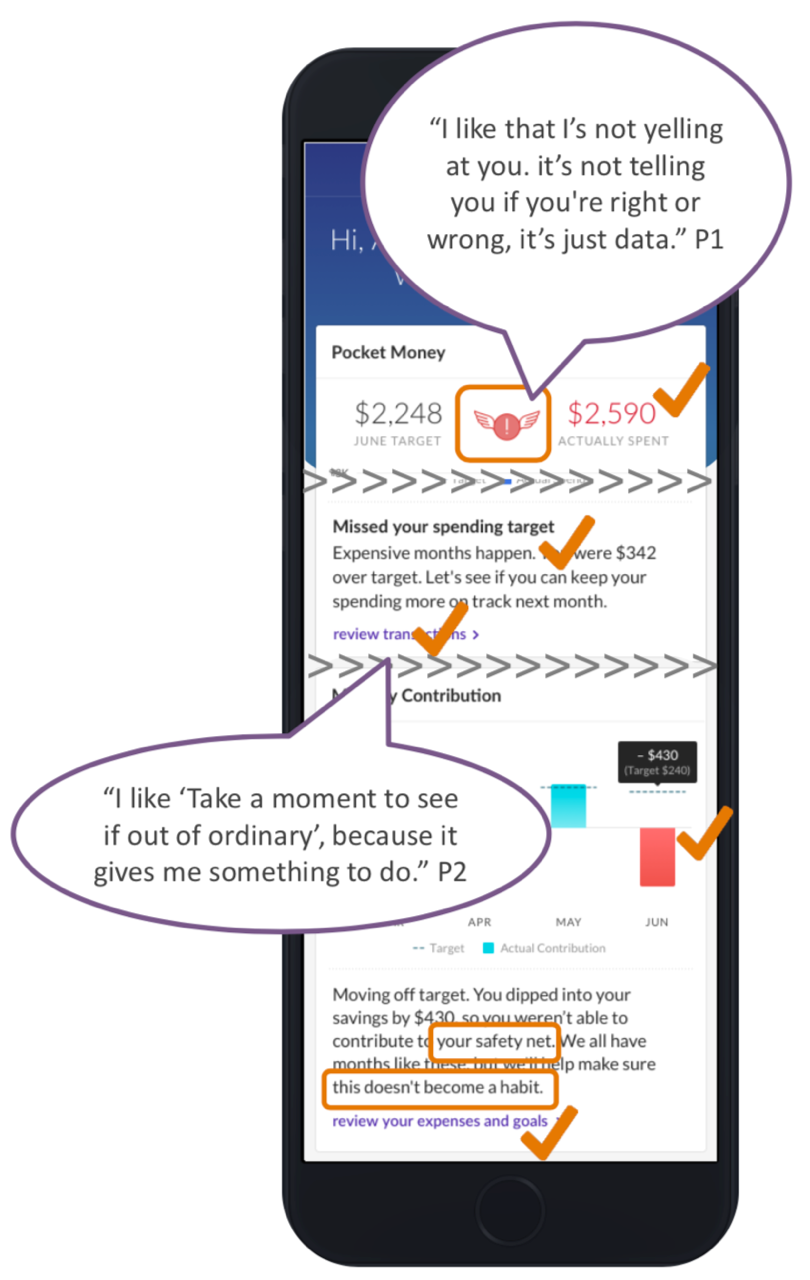
The copy was spot on. Participants appreciated the supportive tone, calling it “compassionate”, "neutral", "non judgmental", and "not yelling at you".
Using red to indicate a negative or "something's wrong" was intuitive and useful.
The option to see more data (review transactions, review expenses) was appreciated.
Participants enjoyed seeing the month over month comparison. They liked that Cinch was “doing the math” for them.
Some terms and labels, such as “monthly contribution” and “safety net” were unclear and confusing.
Some desire for even more details, such as the ability to drill down for more information.
The final outcome
Taking the research learnings, I again continued to iterate until landing on this final version below. These monthly financial check-ups become available at the end of each month, and past months are always accessible.
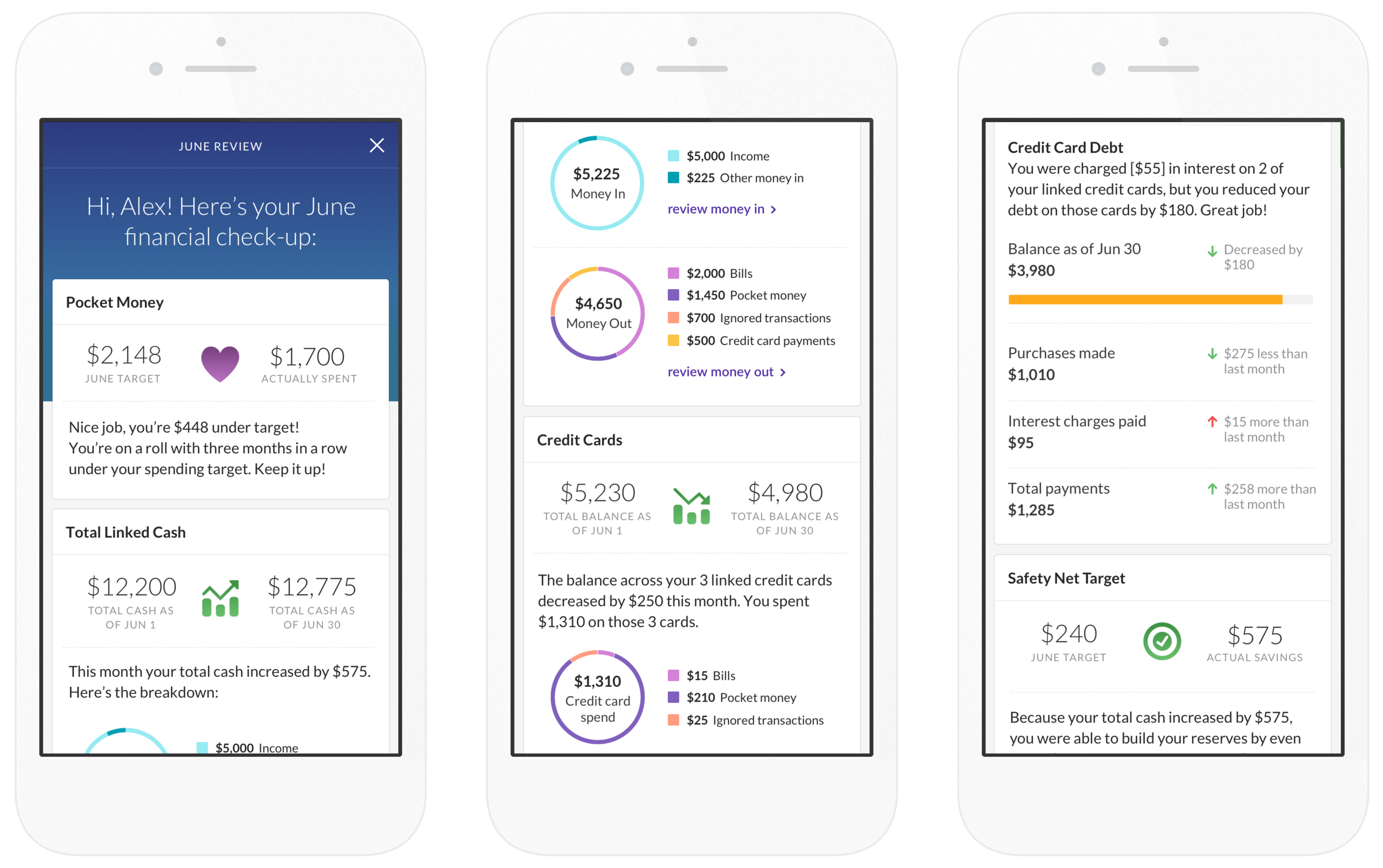
Final designs for end of month review shipped in July 2018